Sin Ramen
Identity, menus, signage & illustrations
2026
@ Okidoki / Atelier
Full case will be published shortly
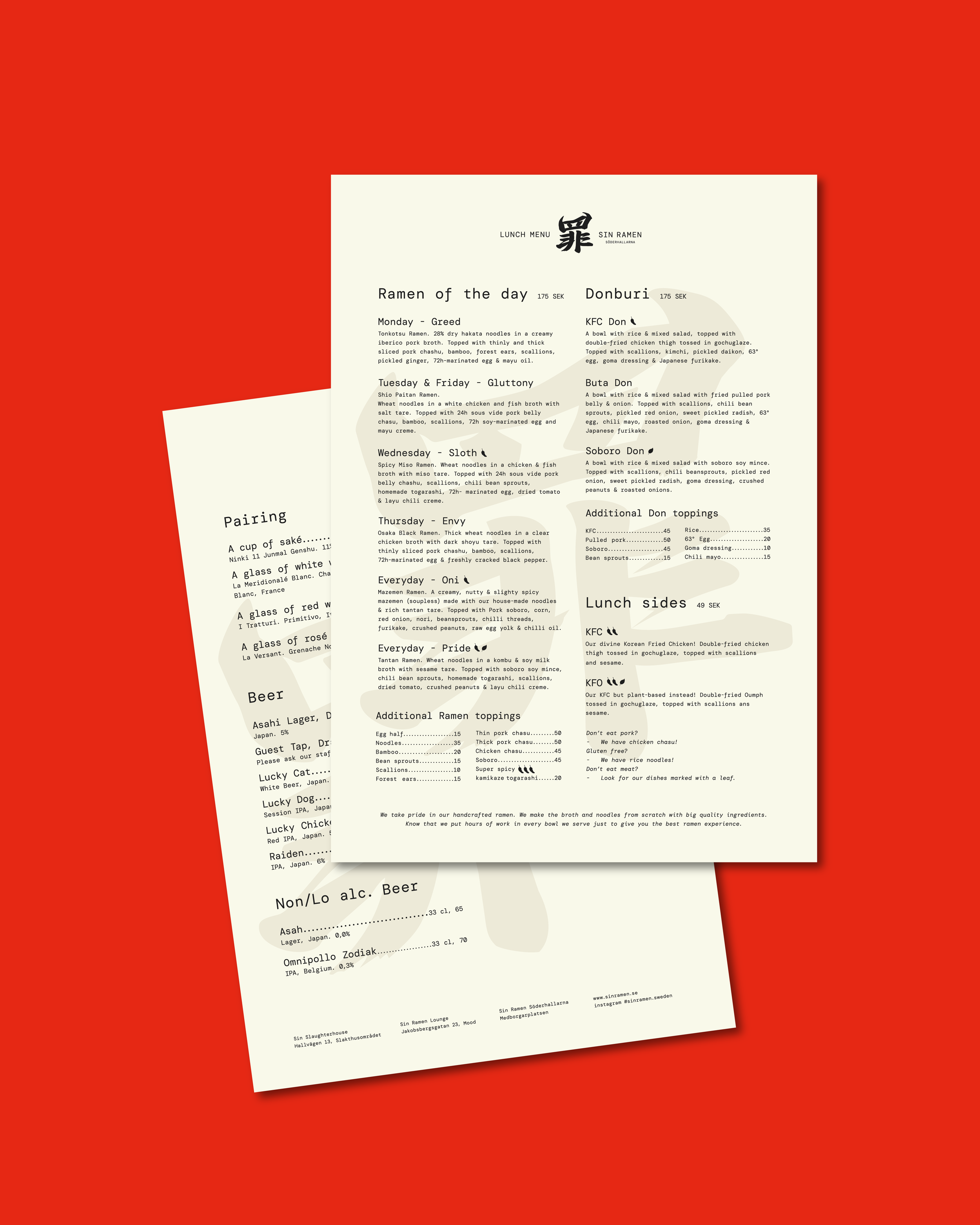
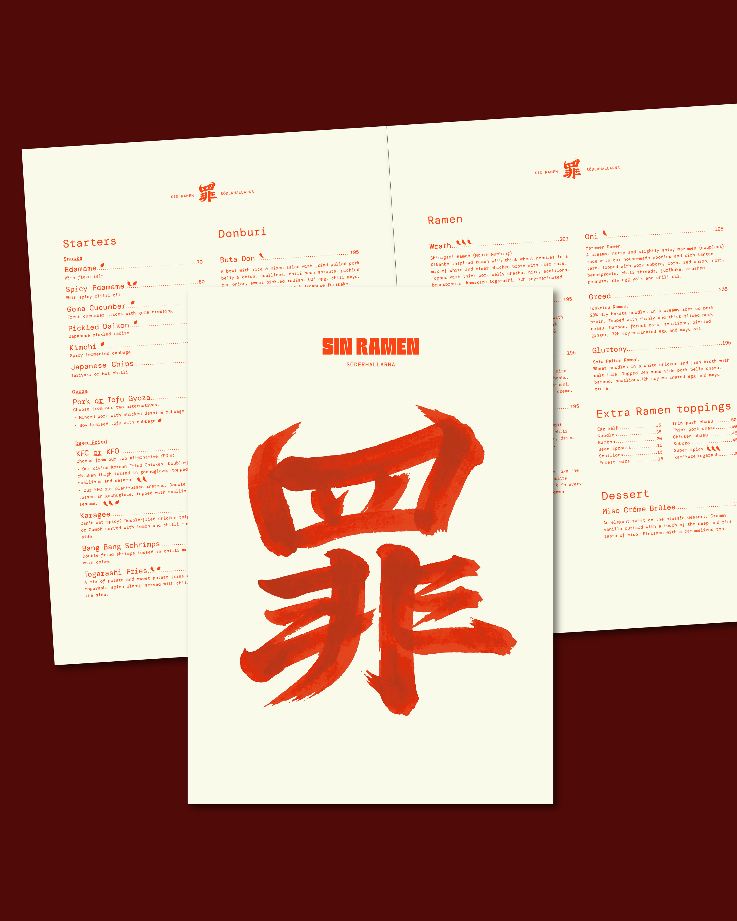
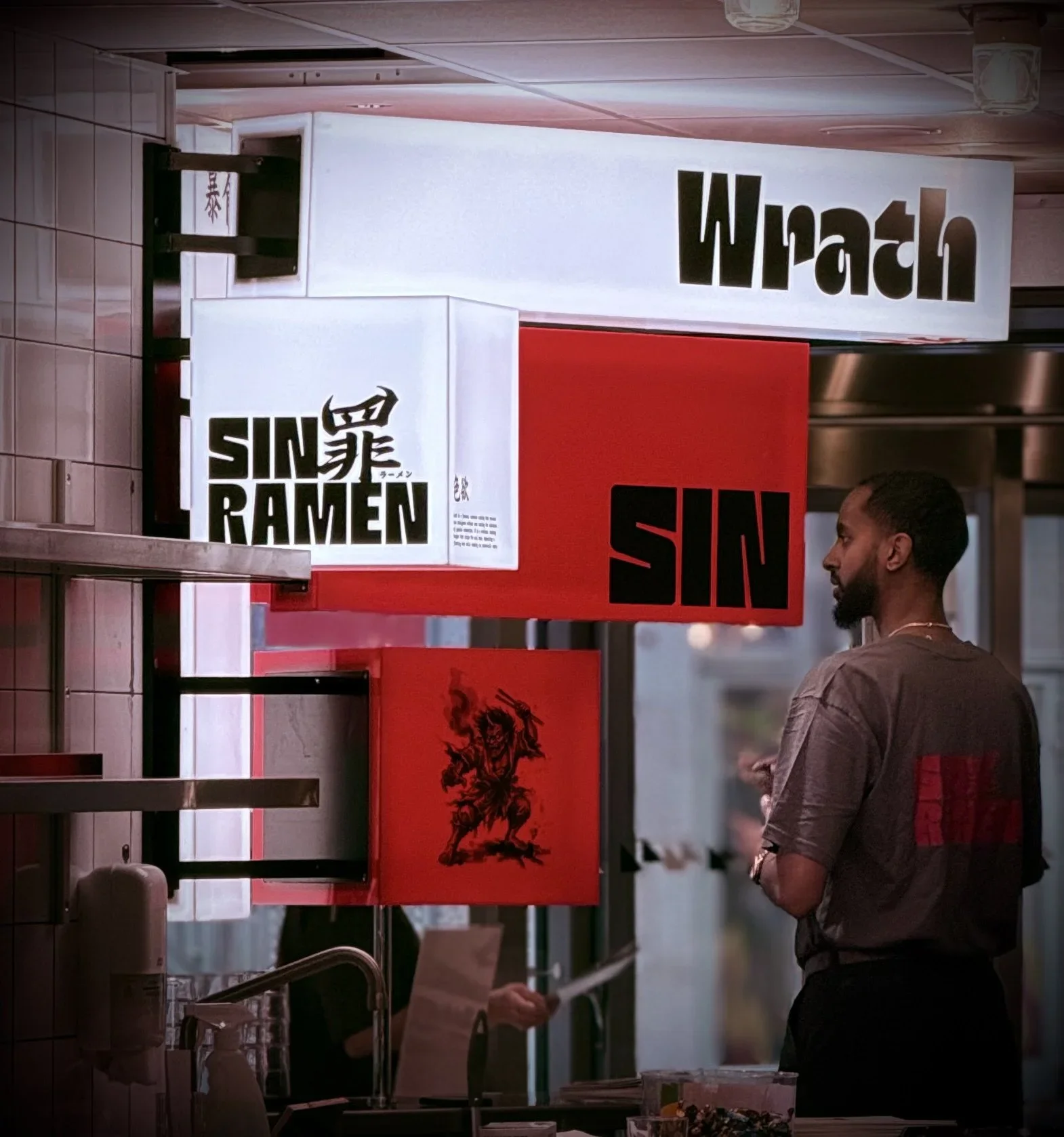
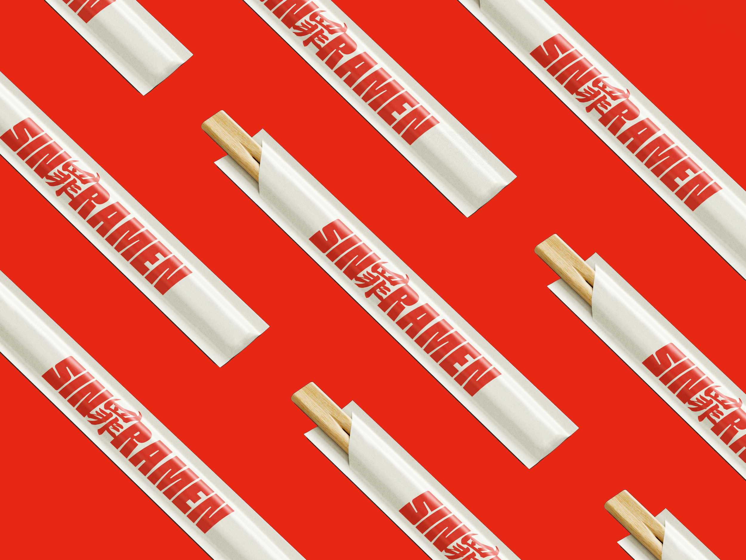
As Sin Ramen prepared to open its third restaurant, the decision was made to implement a new identity for the restaurant chain. The goal was to continue using the seven deadly sins as a thematic element in the brand’s communications, but through an entirely new graphic style.
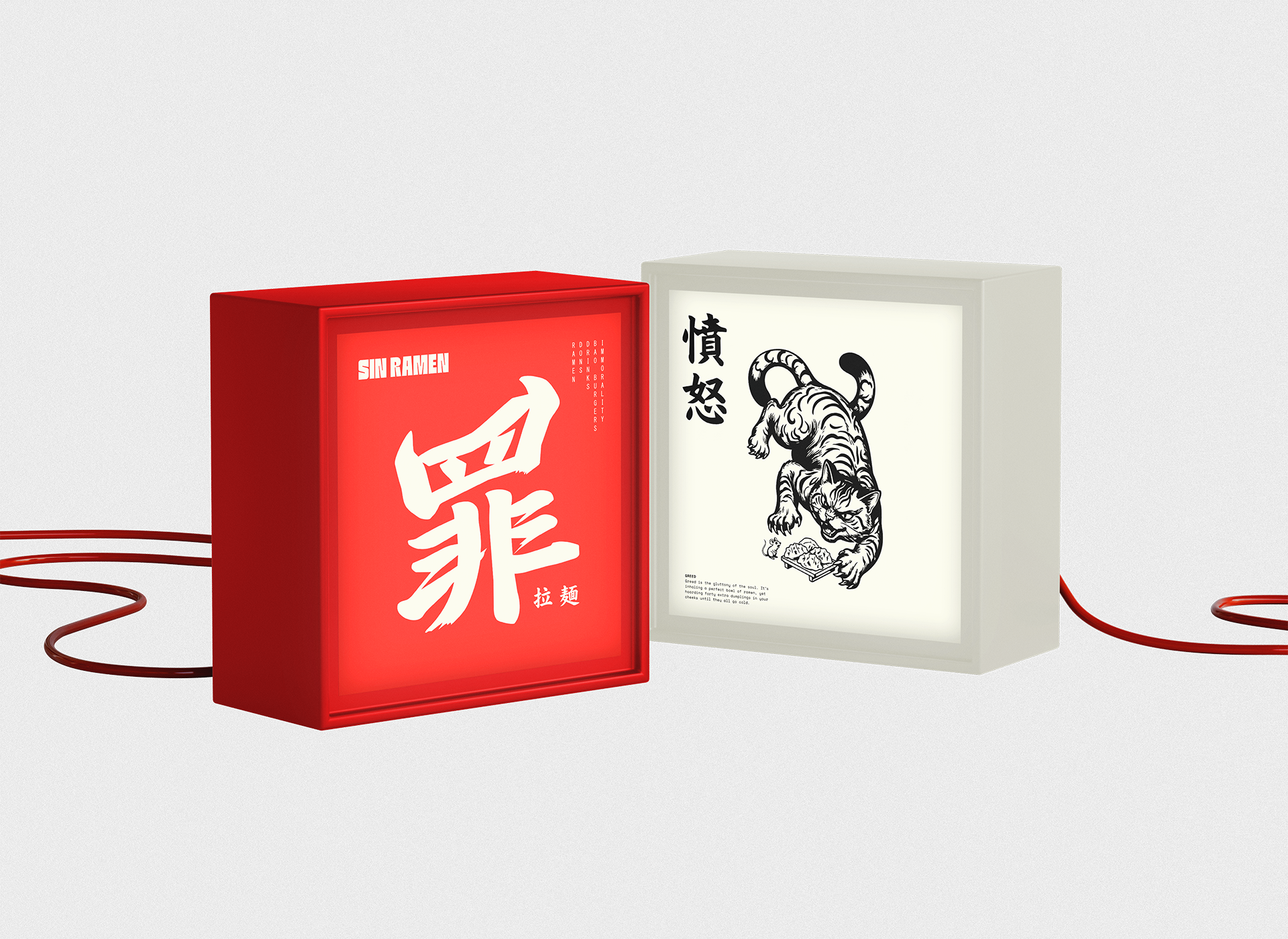
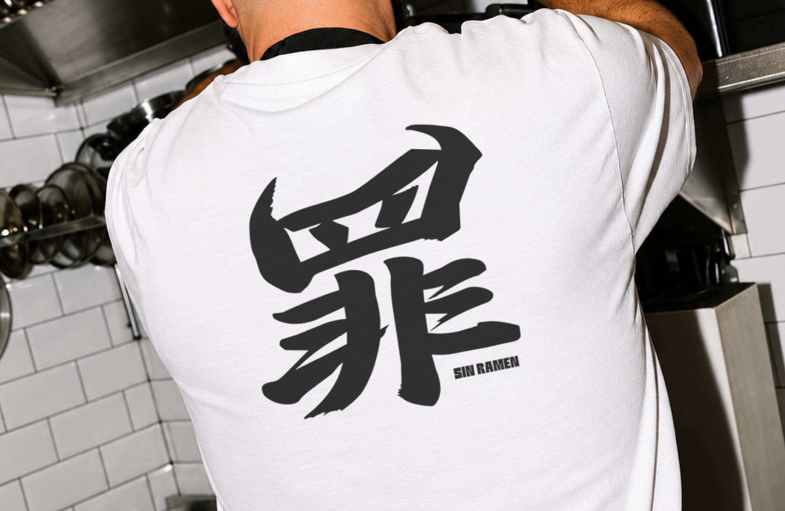
The new icon is derived from the kanji character for "sin," reimagined with more diabolical features. The seven deadly sins—which also serve as the names for the restaurant’s signature dishes—are depicted through illustrations that appear both within the restaurants and across the brand’s communications.
The first restaurant to feature this new visual identity opened in October 2026 at Söderhallarna.